Two products, three component libraries, and no developer who owned the design system.
The design team's design system lived in Figma, and the developers recreated its styles in their own code instead of using its design tokens. Storefront and Hub were built on three different component libraries, and custom styling spread through both. The design system took hold when a developer took ownership of it, and when it moved into code, where AI could use it too.
- Client
- Storefront and Hub
- My role
- Design system designer and head of design
- Result
- One design system in code, shared by both products
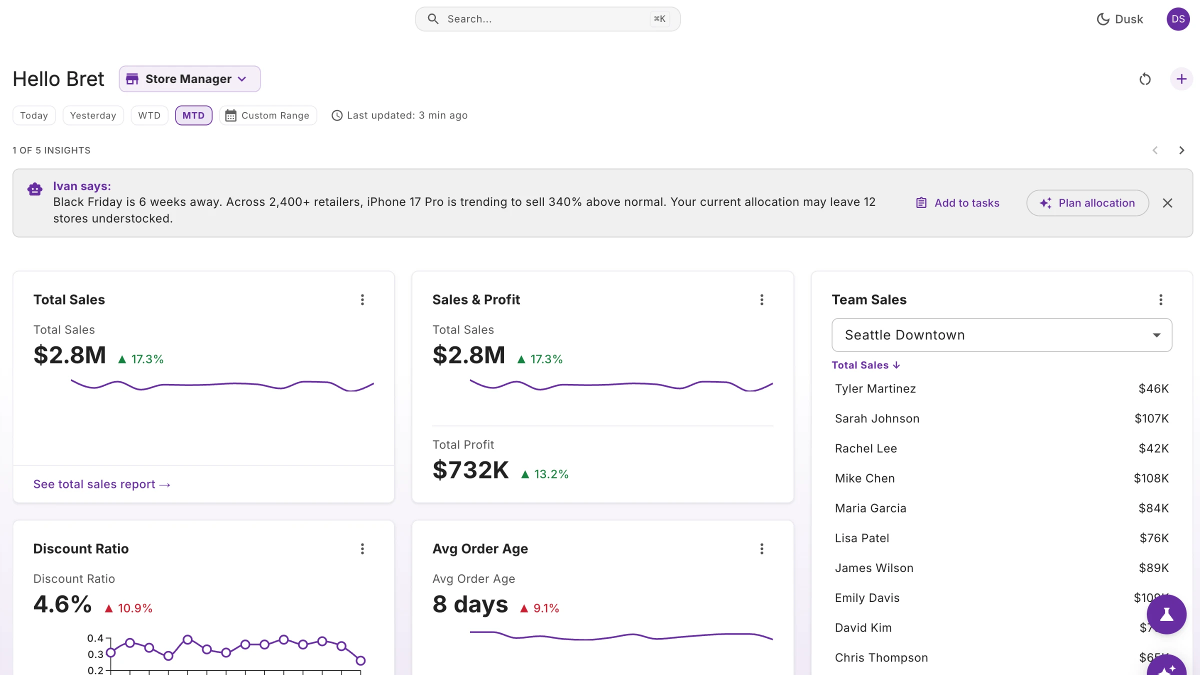
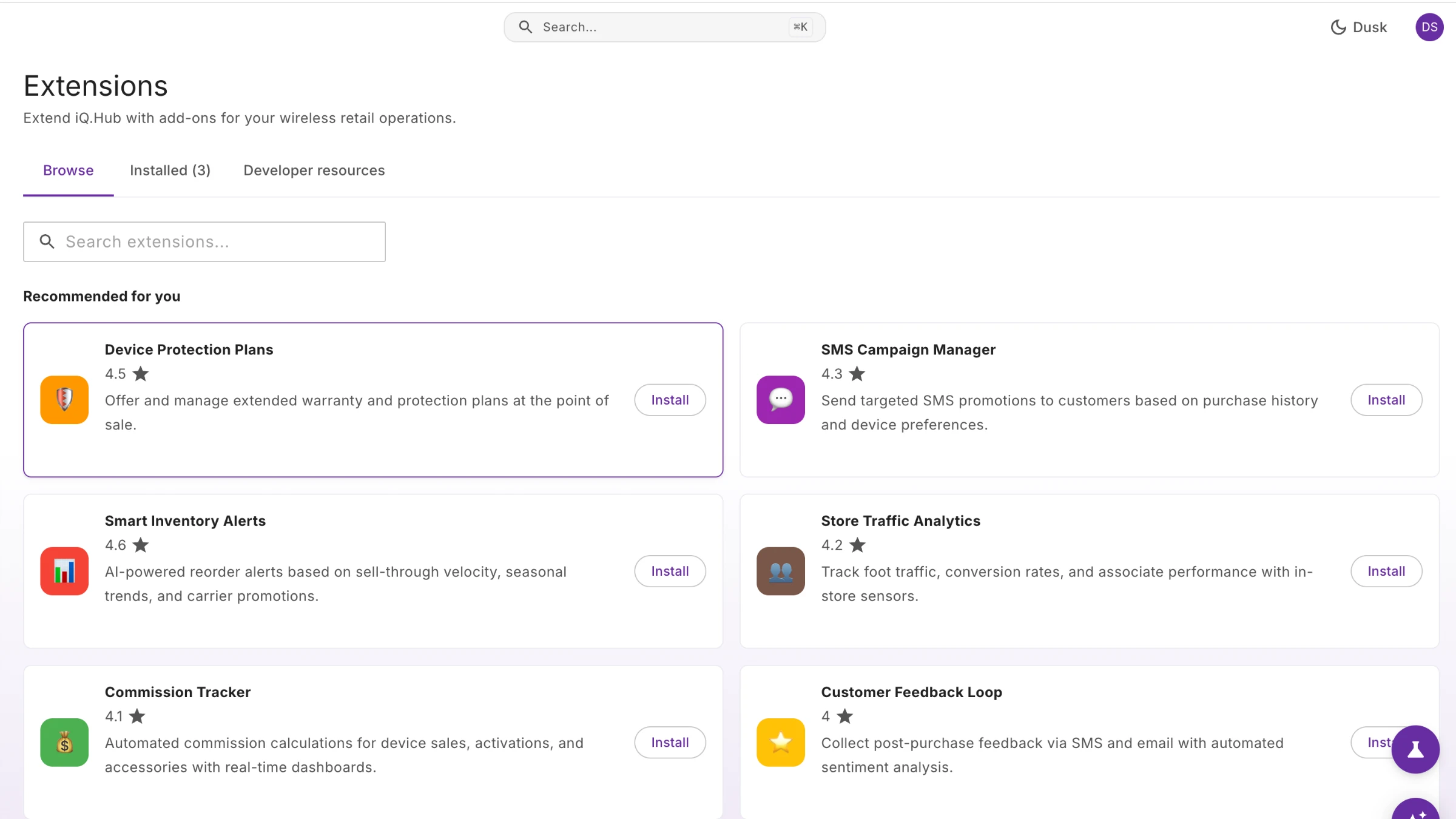
The screens are from the design team's playground and use made-up data.
How it started
When the company started rebuilding its retail platform, the tech teams chose a different technology for each new product, and each technology came with its own component library. Storefront, the new POS, used Google's Material Design 3 library for Flutter. The company was still working out its new brand, so I decided to use the library's defaults, with no changes, until the brand was settled.
Hub, the new back office, was meant to use Google's Material Design 3 library for React. Google stopped supporting it, so Hub moved to MUI. The design team later found that MUI's Material Design 3 version was still in progress, and most of it was still Material Design 2.
The design team had a design system in Figma, documented in Zeroheight: the type styles, the components and how to use them, shown in every design. The plan was that the developers would follow it, and that the library components would be restyled to match it as the new brand settled. The diagram below shows what happened instead.
What went wrong
The developers on both products built on the libraries' foundations and tried to follow the design system in the Figma designs. They were excited to build, and often made their own versions. Even when a screen matched the design, it didn't use the tokens, so the styling was custom everywhere. Heading sizes, from H1 to H6, and captions were set screen by screen. Instead of one shared button, there were several custom ones, with different corner shapes and different touch areas. Some custom components broke AA accessibility without anyone realizing.
The design team didn't find out about MUI's gaps right away, because the Hub developers had already started customizing its components.
Most of the developers had spent their careers on software that was 25 years old, and a design system was a new way of working for them. The design team gave demo after demo and presentation after presentation, and it still didn't take hold.
What changed it
In the end, neither Storefront nor Hub got the developers using the design system. A developer portal did. The company was planning a developer portal, where enterprise customers could build their own workflows. I pointed out that outside developers would need a design system to build with, or every customer's work would look and behave differently. That made the case.
The senior tech lead took ownership of the design system and made it the way the developers worked, and from then on the senior tech lead was my main partner. The company wanted the products fast and good-looking, and left how to get there to the design team and the senior tech lead. Once the design system started fixing problems the developers were already hitting, with layout, consistency and accessibility, they came on board.
Moving it into code, with AI
The design team had been building the design system in Figma and documenting it in Zeroheight. AI was changing quickly, so the design team changed course. The design team moved the design system into GitHub, with a playground where designers built prototypes with Copilot, and stopped building the Figma component library.
I built the tokens: the named values for colour, type, spacing, corners, shadows, motion and more, each with a raw value and a named use, for light and dark. I handed them to the senior tech lead, who built one shared design system from them. The developers on each product then updated their components to match it, and that is what made Storefront and Hub consistent. Because the design system lived in code, the developer portal could use it too, whatever language customers built in.
The design system in code
Moving to GitHub changed how the design team worked with the developers. I wrote the design system as files: the tokens, and the rules for how to use each component, in Markdown that developers and AI could both read. The design team stopped designing in Figma and designed in the playground instead, so Figma became an afterthought. The developers checked their work against the same files, and used the same tokens.
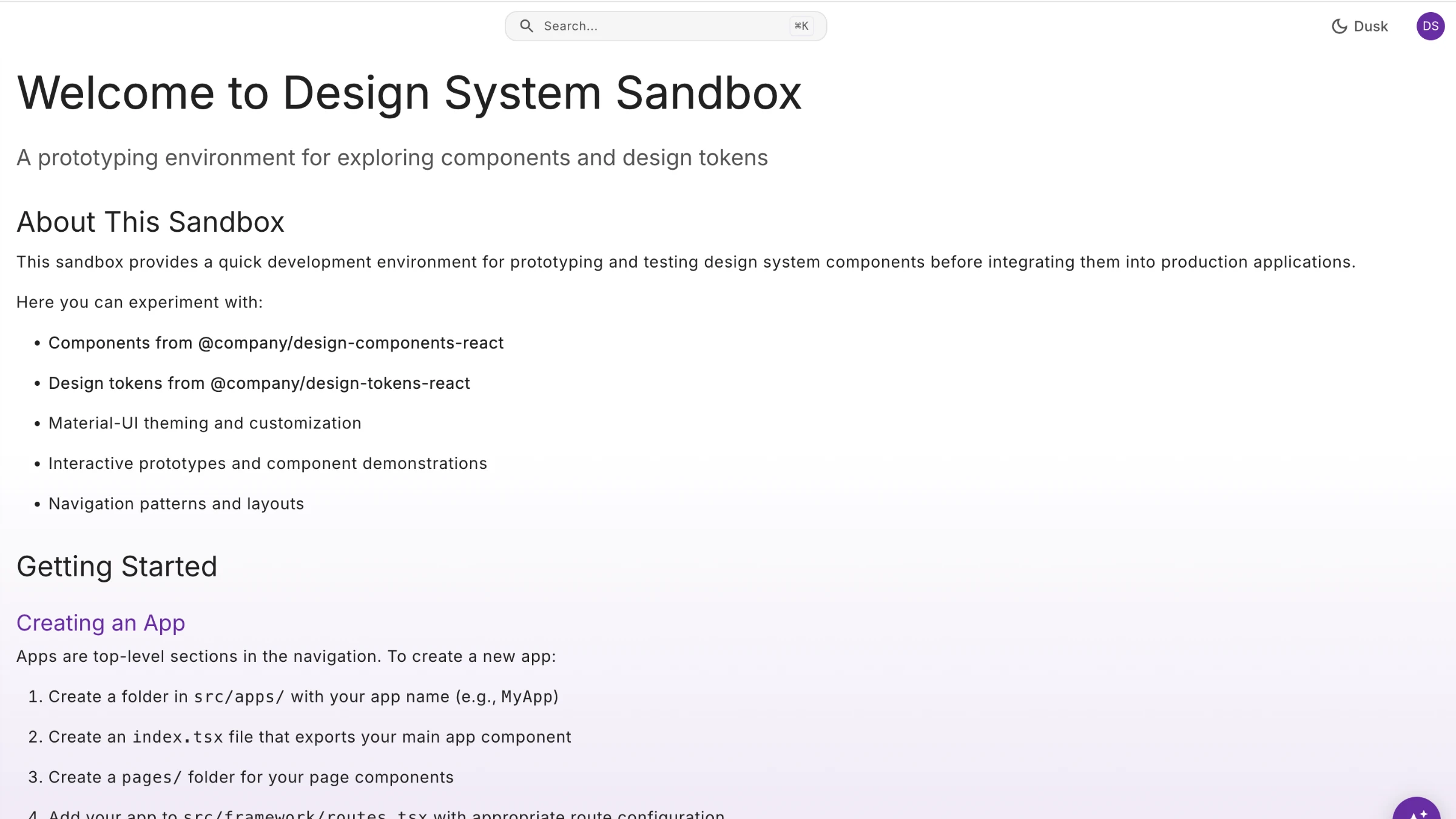
The playground ran on the same components and tokens as the products, so a designer's prototype looked and behaved like the real thing from its first screen. The screens below start with two of the files, then show prototypes from the playground.
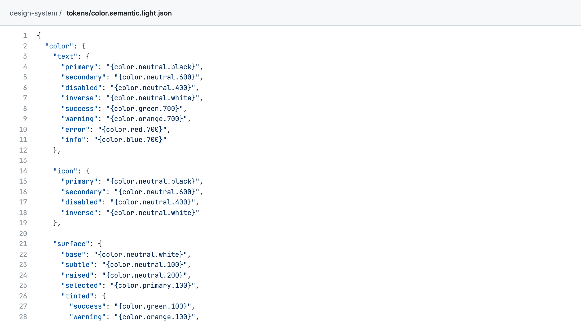
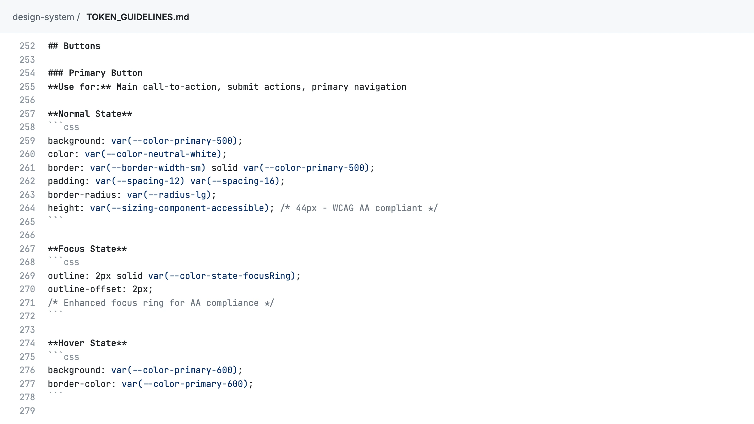
The colour tokens I wrote, in GitHub. Each colour is named by what it is for, and points to a raw value.
The result
By the time I left, every major React component ran on the design system, and the Flutter components were on their way. The colours met AA contrast in light and dark mode. The rules were written in Markdown files that people and AI could both read, and code checks stopped custom styling before it reached the products.
What I'd do differently
I'd find a developer ally from the start. I only found one once the problems had surfaced, and a design system needs a developer who owns it.
I'd also push for one component library for both products before the technology was chosen, write the rules in Markdown from day one instead of moving them later, and write down the patterns sooner.